
What the Pantone 2026 Colour of the Year means for marketing psychology
Every December, one colour captures the world’s mood. For 2026, the choice may surprise you. Pantone chose a shade of white called Cloud Dancer.
Pantone made a bold move by selecting Cloud Dancer (PANTONE 11-4201). It is being marketed as a “relief from overstimulation”, “a fresh start” and “a blank canvas for new possibilities”.
In this blog, we explore the marketing psychology behind Cloud Dancer, how colour influences consumer behaviour, and how marketers can apply this insight to branding, design and strategy.
Cloud Dancer and the mood of 2026
Pantone’s Colour of the Year shapes how brands present themselves and how people respond to what they see. This is the first time that Pantone has selected a colour within the white colour family.
According to Smithsonian Magazine, Cloud Dancer represents “a blank canvas”, mirroring a widespread desire for stillness, clarity and renewal. You can view the shade directly on Pantone’s official site.
What does this mean for you as a marketer? Colour choices in branding aren’t just aesthetic, but strategic. And Cloud Dancer is sending a message, let’s unpack how.

Understanding Cloud Dancer
So, what exactly is Cloud Dancer?
Visually, it’s a delicate shade of white, soft, balanced, minimal. Emotionally, it signals openness, simplicity and peace. In an era defined by overstimulation, this shade of white offers relief.
Pantone described the shade as evoking “the clarity of a fresh page”. It fits into a larger moment where audiences crave less noise and more meaning.
Friesens points out that the choice aligns with a surge in minimalist design and slower lifestyles.
The psychology of colour in marketing
Colour is one of the first things people notice. It affects how they feel, what they trust, and what they buy. That’s where marketing psychology comes in.
Cloud Dancer communicates simplicity, safety, and honesty. In a world filled with clutter, white stands out by stepping back.
Research suggests lighter, low clutter palettes and generous white space can support readability and focus
- Reduce cognitive load in design
- Reinforce a minimalist, premium aesthetic when paired with the right contrasts
- Influence perceptions like clarity and trust in some contexts
These traits are gold for marketers trying to build loyalty or position a product as premium or wellness oriented.
Cloud Dancer and consumer perception
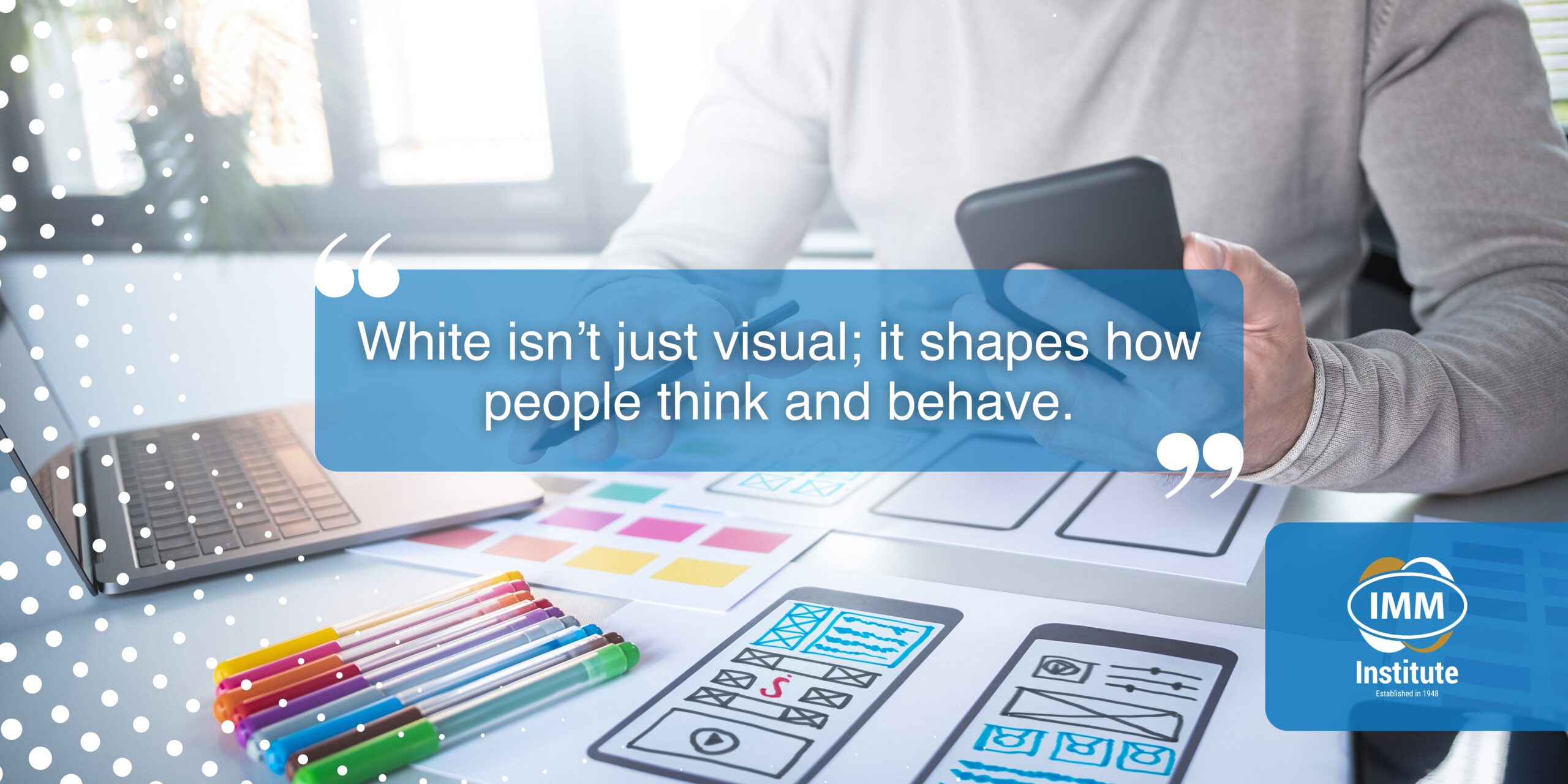
Cloud Dancer isn’t just visual; it shapes how people think and behave.
From a user experience perspective, white space reduces cognitive load. It lets the eye rest. It makes information easier to digest. It can even increase conversions in digital design.
From a brand perspective, it communicates transparency, restraint and confidence. As ABC News notes, this colour choice resonates with consumers seeking peace in a chaotic world.
But Cloud Dancer also carries risk. It can feel sterile if overused. It requires thoughtful application. That’s where marketing strategy comes in.

Marketing strategy: How brands can use Cloud Dancer
So how can marketers use Cloud Dancer effectively? Here are a few practical ideas:
- Minimalist Branding: Use Cloud Dancer as a base to highlight key brand elements. Pair it with a contrasting accent colour for modern, high-impact visuals.
- Digital UI: Leverage Cloud Dancer for cleaner, calmer user journeys. Think app dashboards, email design, or landing pages.
- Packaging: Cloud Dancer communicates peace, wellness, and sustainability. Perfect for supplements, tech or eco-conscious products.
- Premium Positioning: Cloud Dancer implies luxury through restraint. Apple mastered this. So can you.
If used strategically; Cloud Dancer isn’t plain. It’s powerful.
Building marketing & consumer insight skills with IMM
Understanding colour psychology isn’t just about picking a shade. It’s about knowing your market, your message, and your positioning.
That’s where marketing fundamentals come in.
The IMM Institute’s Fundamentals of Marketing online short course covers:
- What marketing is and why it matters
- How customers think and behave
- How to analyse your environment and competition
- How to segment, target and position with intention
With this knowledge, you can go beyond design trends and make strategic branding choices grounded in consumer behaviour.
What marketers should take away
Colour affects behaviour and it changes how people think and respond. Cloud Dancer signals a move toward clarity. It reflects a public mood that values calm. It fits into minimalist branding and modern design.
Marketers need to use white space with purpose and let it support your message. Know how it shapes perception by being aware of where it works and where it doesn’t. To view Cloud Dancer, go to the official Pantone listing. To build your marketing knowledge, visit IMM Institute.